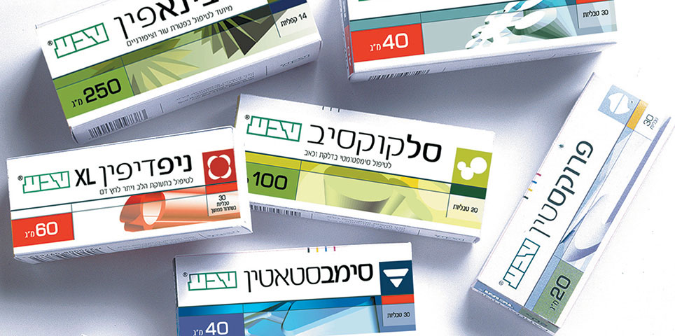
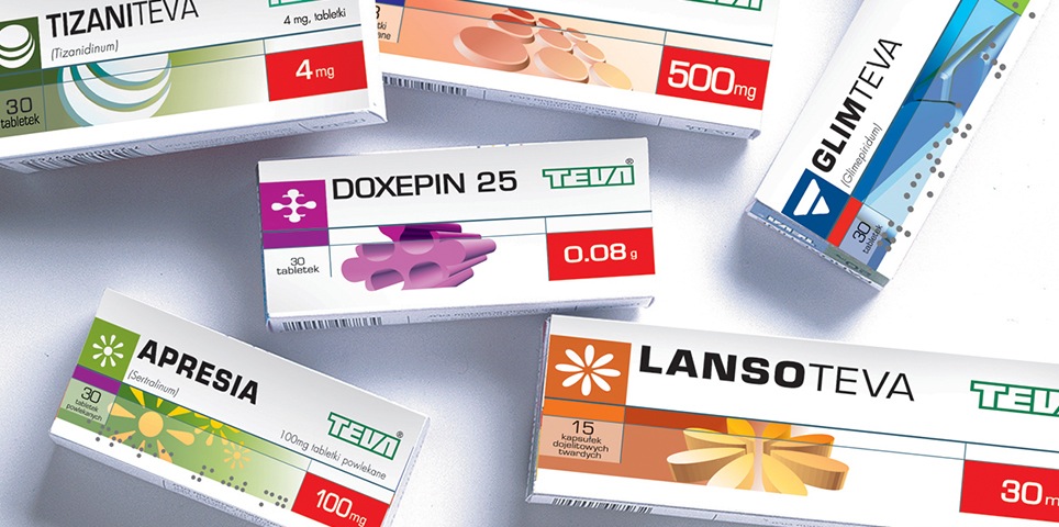
Prior to our strategic and creative process, Teva Generics’ line of medications suffered from a lack of consistency and coherence in packaging design, which led to confusion and damaged the brand’s sense of authenticity among both consumers and pharmacists.
The products did not display any consistency in identity – for example, the size and positioning of the name of the medication, and of graphical elements in terms of their positioning, size and composition on the packaging.
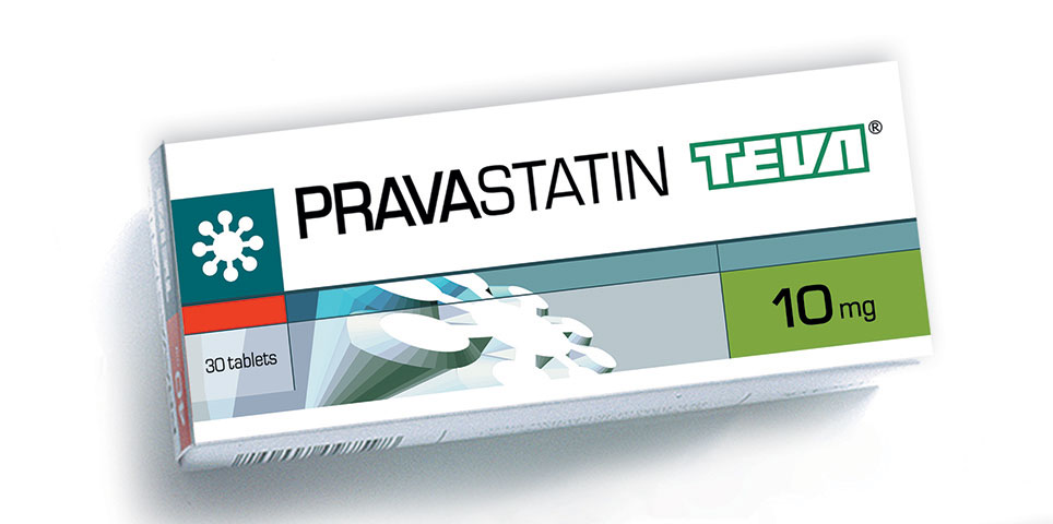
The aim of the branding process was therefore to develop a unified and consistent design language, while also creating a feeling of authenticity, quality and product differentiation. Our goal was to assist pharmacists and consumers by developing a clear differentiation between the various medications (in cases where there are multiple versions of the same medication), and to strengthen the link between the Teva brand and the products, in order to reinforce the consumer’s sense of security.
The process turned out to be a big success with pharmacists, who were now able to easily differentiate between the many different product packages. The success of the process also led to Teva Poland and Teva South Africa to adopt our method and designs in their own markets.
What We Did?
Strategy
Concept development
design
Icon design
Package design
Label design
Printing supervision


