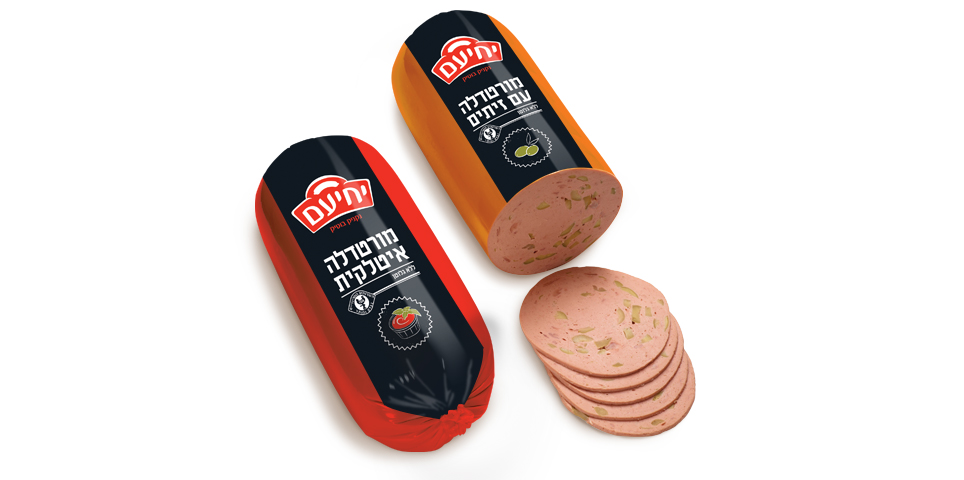
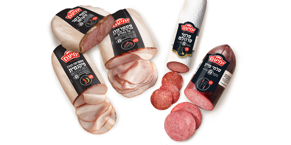
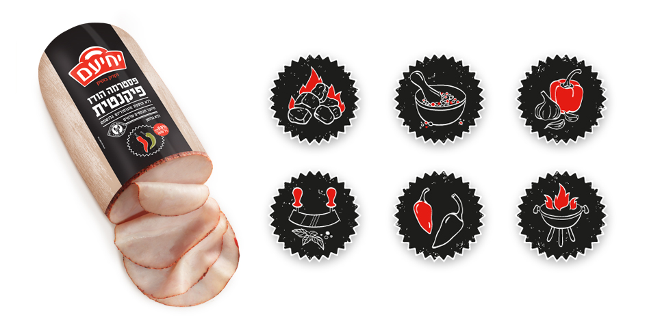
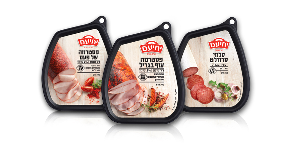
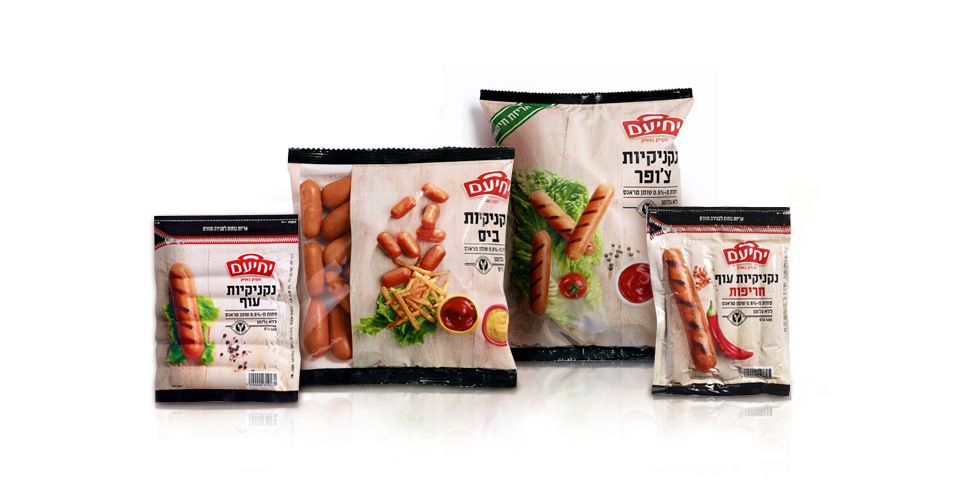
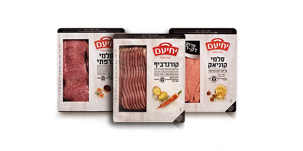
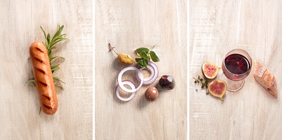
The main motif of the new design is the background texture of a wooden butcher’s block, which conveys a sense of culinary expertise. We chose to move away from the usual photographs of pastrami sandwiches, featuring instead a clear window design that showcases the nature of the product itself. For example, we juxtaposed an image of an individual hot dog with another visual element to add color and flavor, such as vegetables, seasonings and other items connected to the product.
An important part of the brand language, we gave pride of place to the product name and other important sales features, displayed in a bold, black typeface.
What We Did?
Brand strategy
Brand architecture
Concept development
Icon design
Package design
Label design
Photo shooting production
Printing supervision

