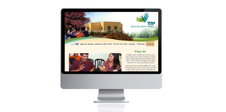
Yachad B’Galil is a wonderful nonprofit that integrates people with severe disabilities into a vibrant community in Kibbutz Mahanayim in the Galilee.
The symbol on the logo represents two differently colored hands. The hands are not clasping each other, but taken together they form a whole that is greater than the sum of its parts. Together they can “fly”.
With regards to the name of the nonprofit, we decided to give prominence to the word “Yachad” [Together], from an architectonic consideration, and in the hope that one day there will be true unity, also with…the Negev, the coastal plain and every other possible location in Israel.
What We Did?
Concept development
design
Logo design
Package design
Label design
Letterhead design
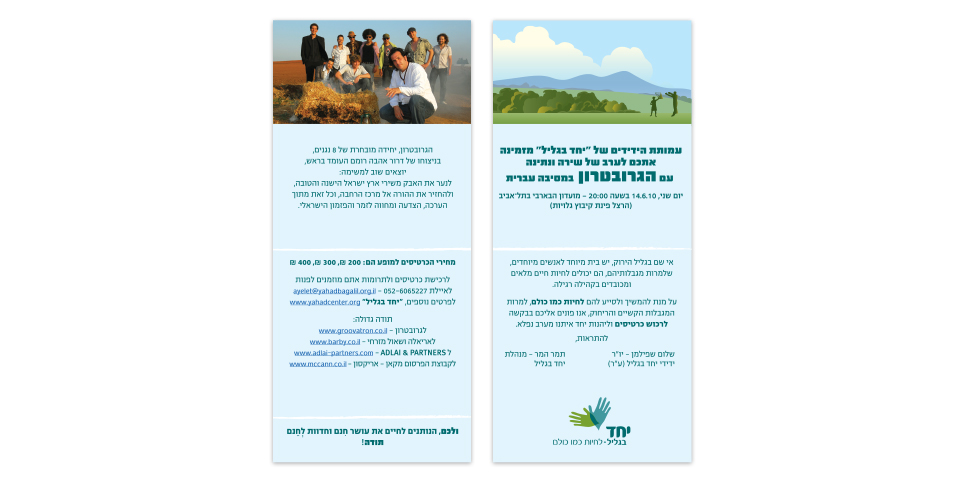
Brochure design
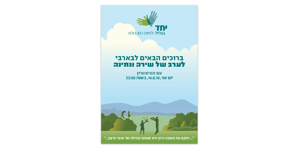
Marketing materials
Photo shooting production
Printing supervision


