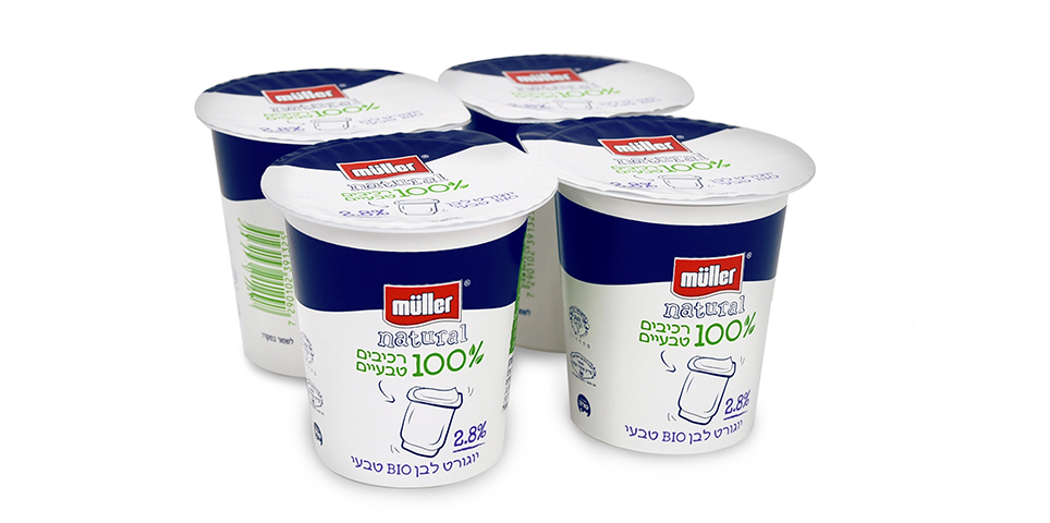
The design for Müller Natural stems from the “white label” concept, symbolizing ultimate purity.
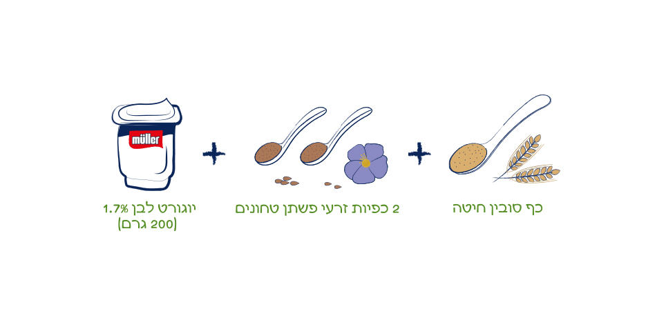
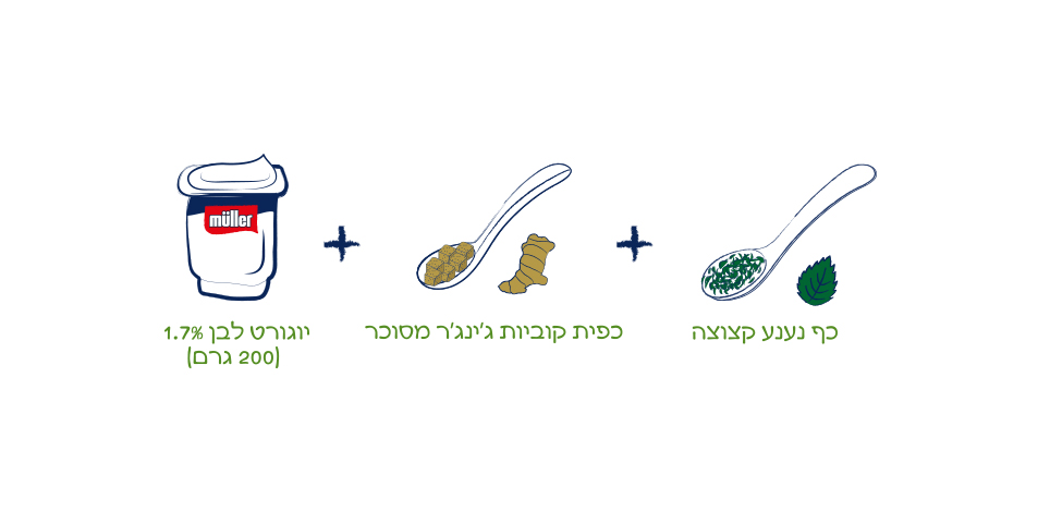
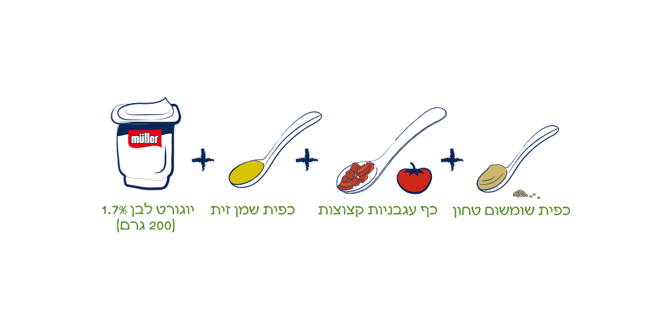
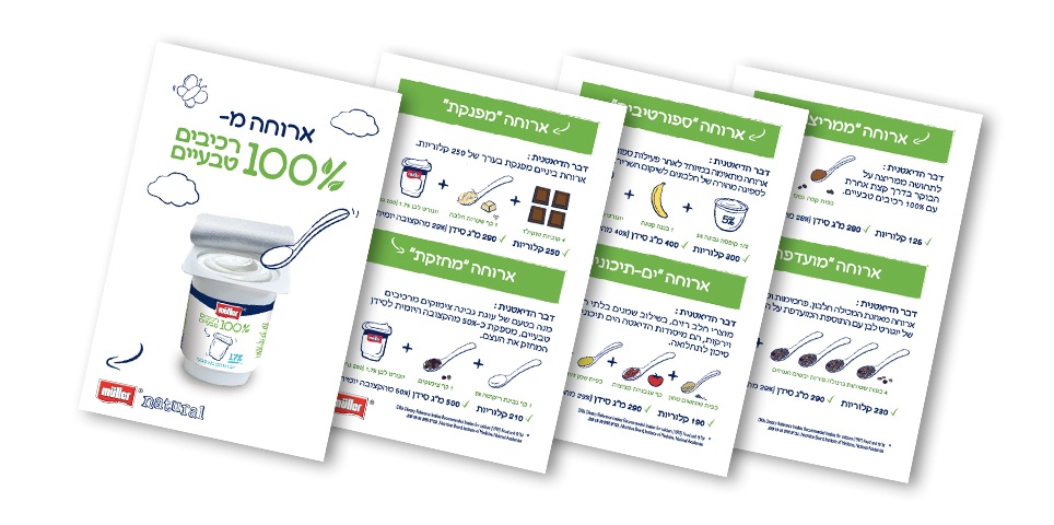
We had previously created for Müller a rich photographic language of nature. With regards to this product category, we found that a minimalist, illustrated brand language was the best fit. This language would convey a sense of naturalness from a place of purity and simplicity. The color green, identified with nature, is incorporated into the design. The % symbol in the inscription ‘100% natural ingredients’ was given a twist, illustrated as a stem with two leaves. We turned the barcode into a delicate plant, enhancing the brand’s connection to nature, and we also created a unique nutrition information table modeled on a chalkboard
What We Did?
Concept development
Logo design
Symbol design
Icon design
Package design
Label design
Marketing materials
illustration
Printing supervision

