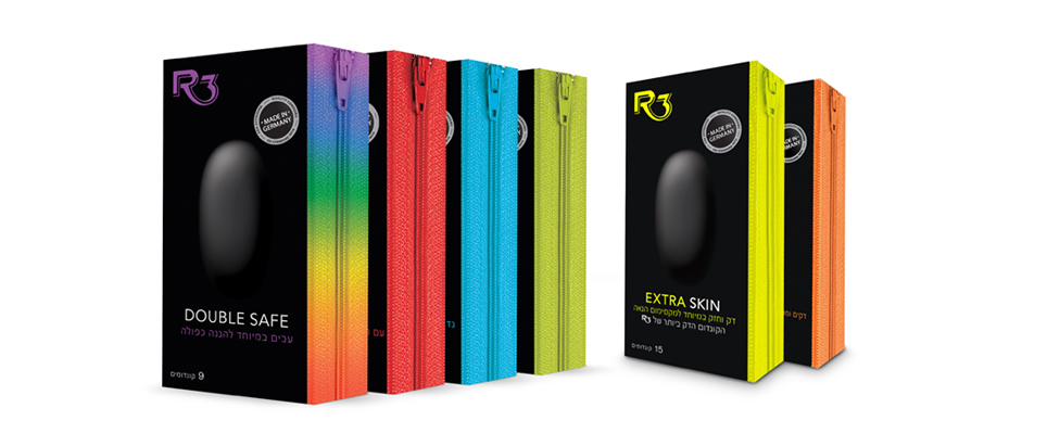
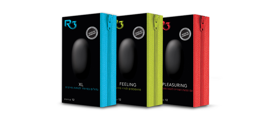
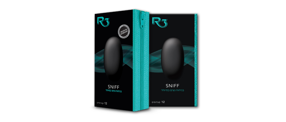
“The slick, black design for R3 condoms creates a distinct fresh look, evoking a sexy nocturnal twist.
The minimalistic approach for the new packaging enhances their visibility in the, mostly colorful, cluttered contraceptive market.
A subtle bulge (embossed and graphically highlighted) on the package front surface alludes to the product for those unfamiliar with the brand. An additional design element of a zipper in varying colors, on the package’s side, supports the sensual attributes and helps differentiation within the range of condoms in the new product line.”
What We Did?
Naming
Concept development
design
logo modification
Symbol design
Icon design
Package design
Printing supervision


