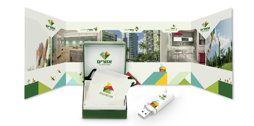
In a world in which real estate companies are nearly indistinguishable from one another, the core values of the Azorim brand that we wanted to convey were choice, flexibility and creativity.
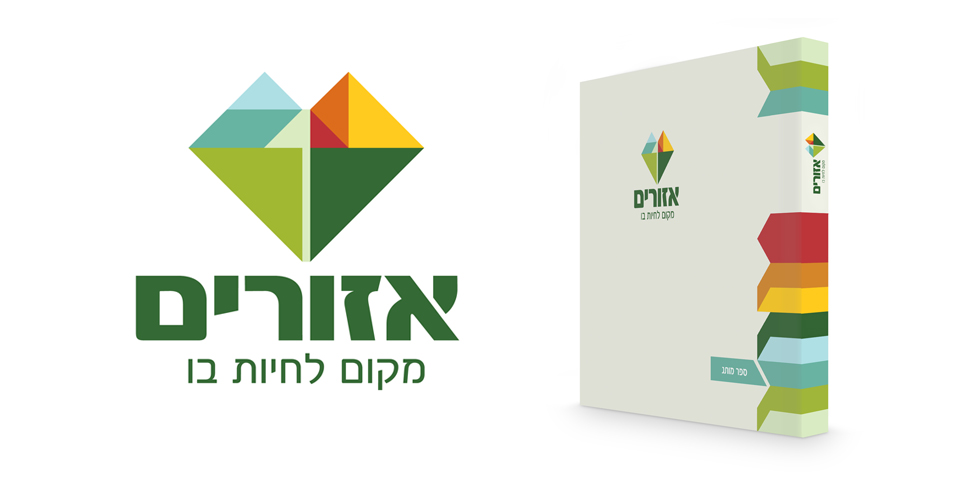
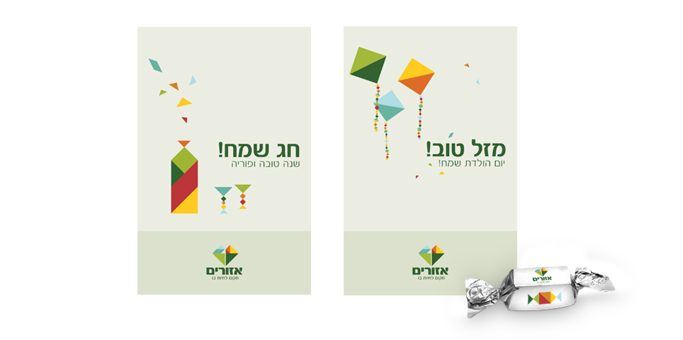
Azorim’s new symbol is based on the Tangram – an ancient Chinese puzzle consisting of seven shapes that can be fitted together to form thousands of different combinations.
The Tangram motif accurately conveys the brand concept – a distinct, unified and harmonious frame, in which there exists ample space for flexibility, freedom and modularity.
The symbol is akin to a heart shape, and also evokes the shape of a diamond. The number 1 can also be found within it.
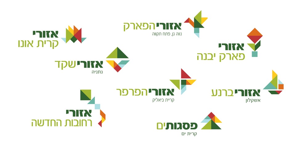
The Tangram idea led us to create logos for each of Azorim’s projects, so that the project’s character or its geographic location influenced the logo design. In this way, we preserved the uniqueness of each project, while reinforcing the overall brand affinity.
What We Did?
Brand architecture
design
Logo design
Symbol design
Icon design
Web design
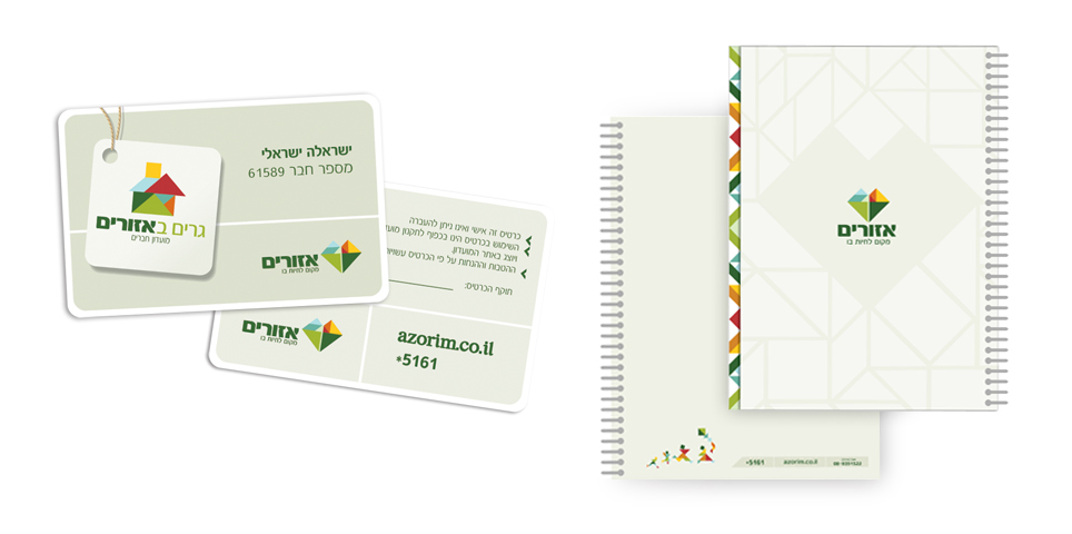
Letterhead design
Catalog design
Branded environments
Point of sale
signage

