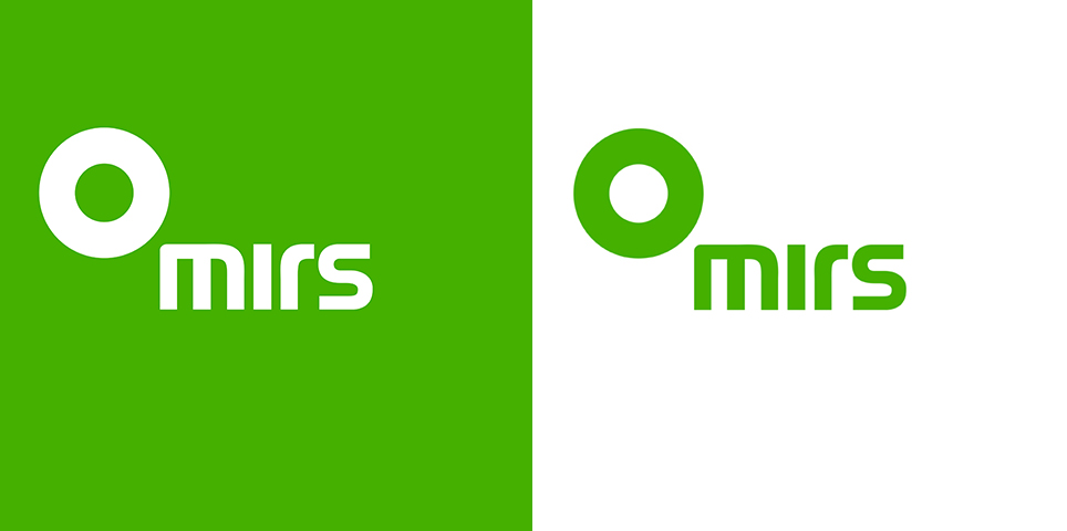
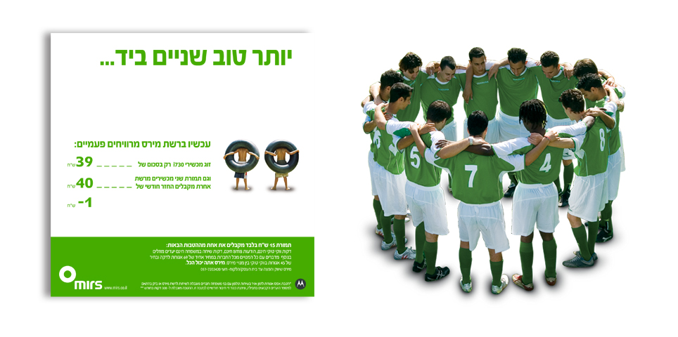
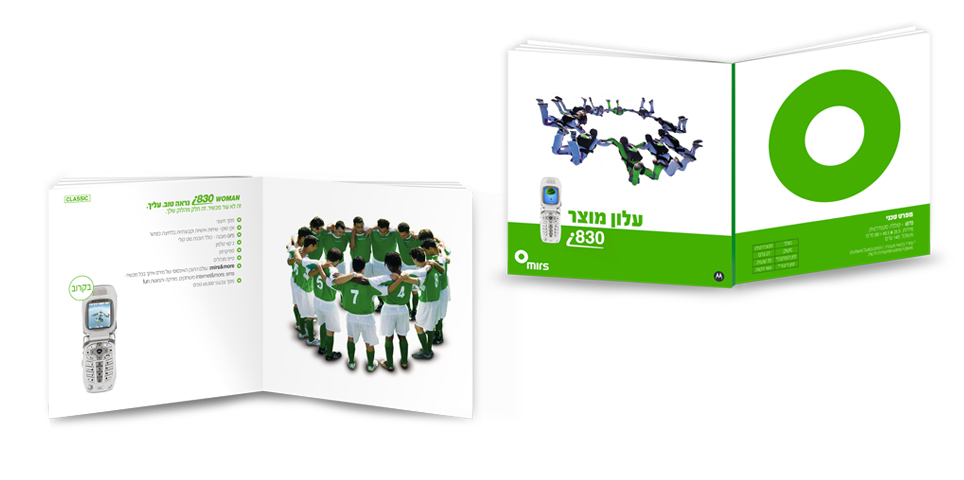
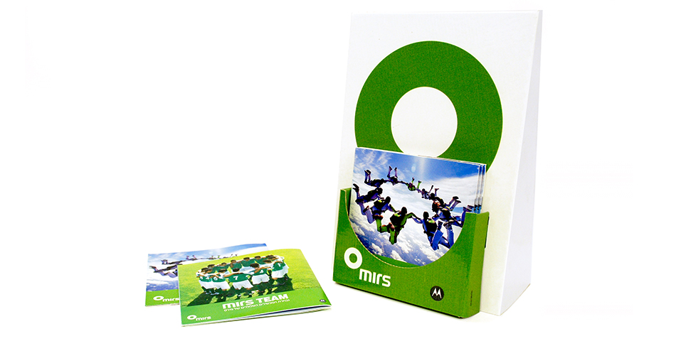
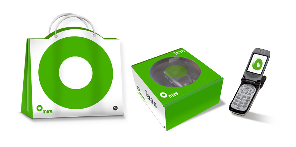
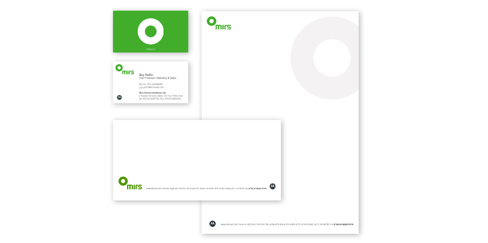
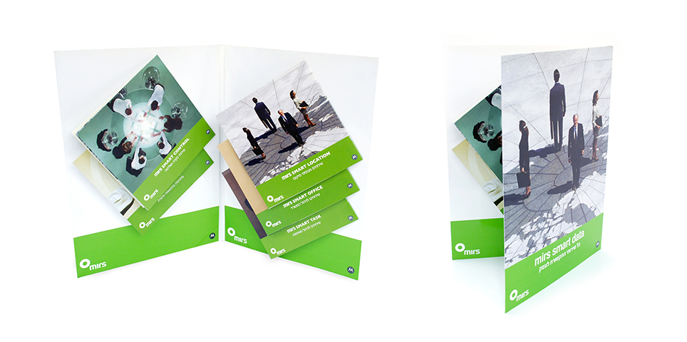
Our challenge was to create a fresh brand language and identity for Mirs while preserving its assets. For example, we found that the color green was identified with the brand and was a suitable expression of its basic values; on the other hand, we stopped using black, which felt heavy and outdated. Instead, we chose to replace it with white.
We began with the brand concept of “the circle”, and from there we derived the new logo and unique photographic language for Mirs.
What We Did?
Concept development
design
Logo design

