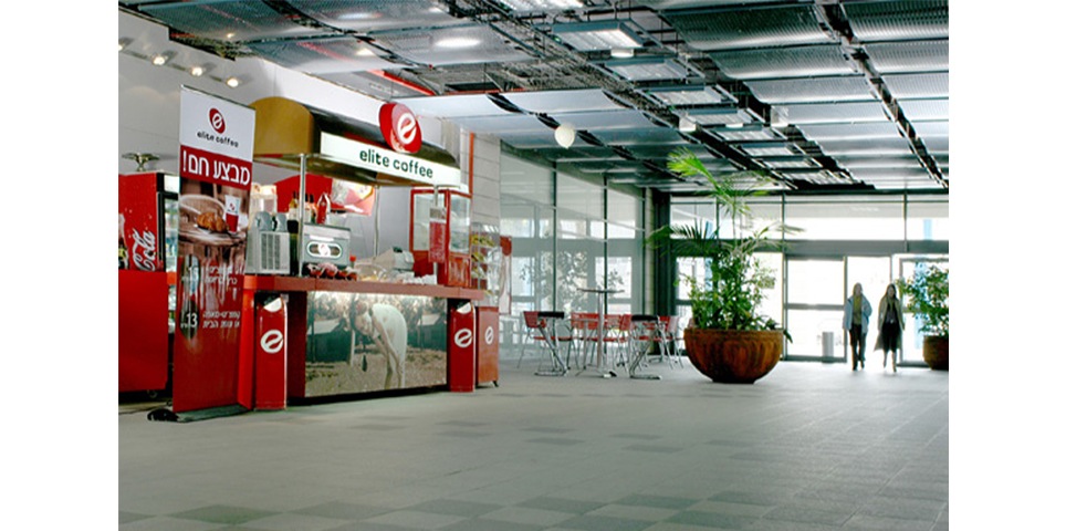
Branding for a chain of coffee shops.
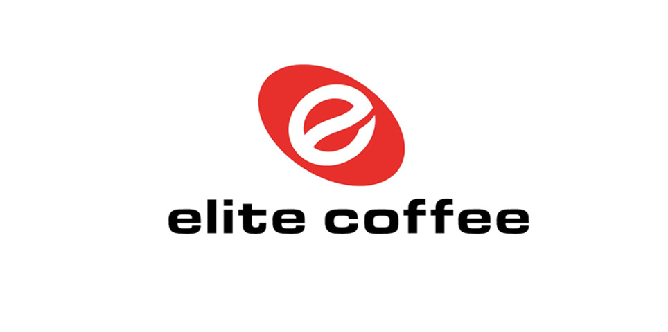
The “e” symbol mark resembles a coffee bean and conceals a spoon (in the negative space of the red background).
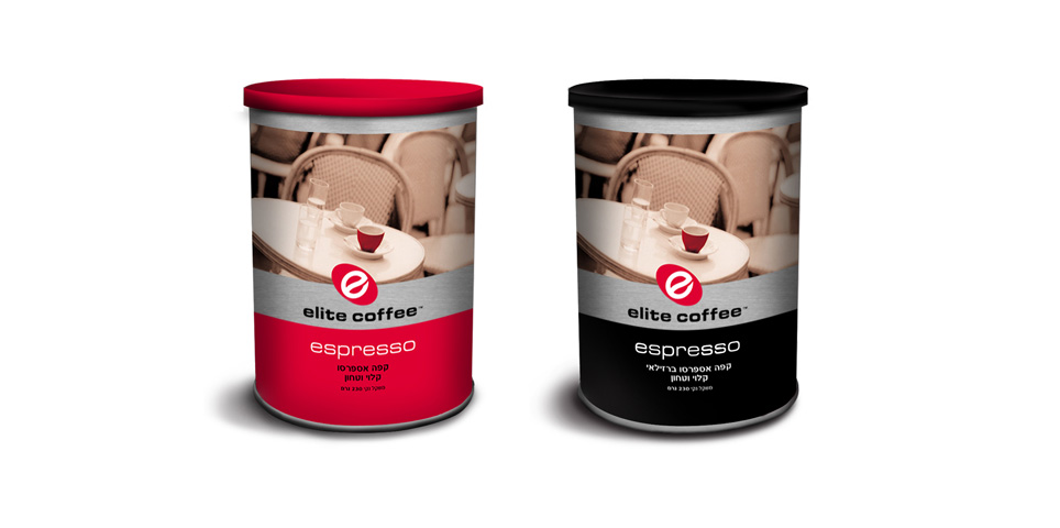
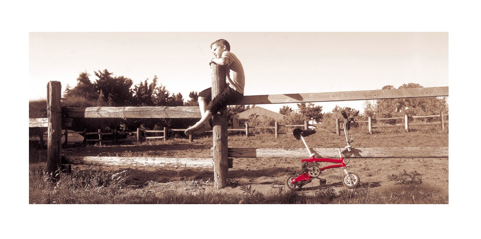
Brand colors Red and Sepia were chosen because Elite (a leading food brand) is associated with the color Red, and Sepia is suitable for the world of coffee.
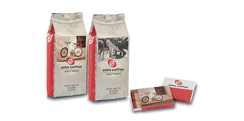
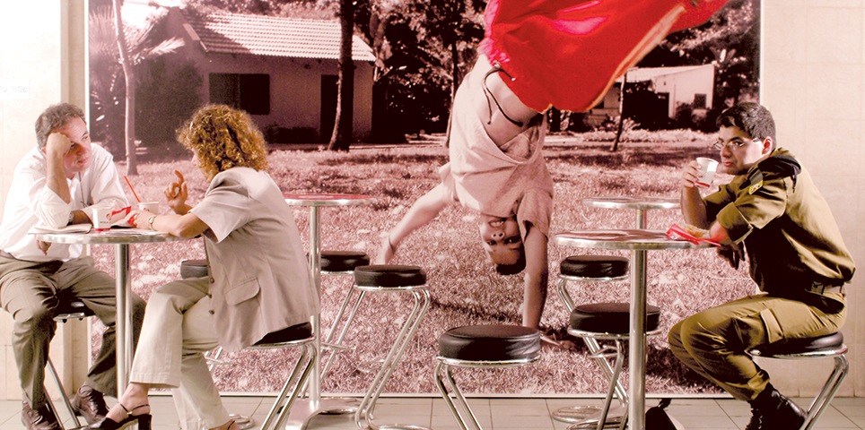
Project scope included creation of photographic images depicting moments of fun and relaxation, trying to capture the brand spirit “Seizing the moment”.
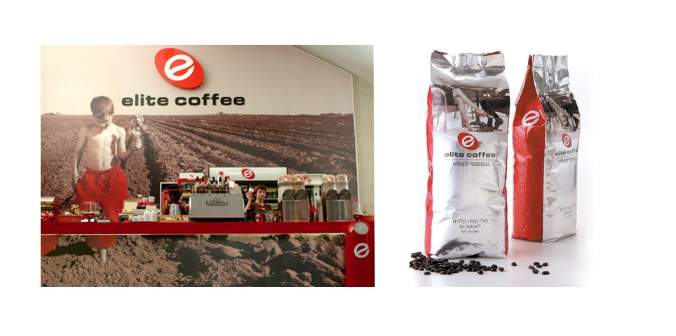
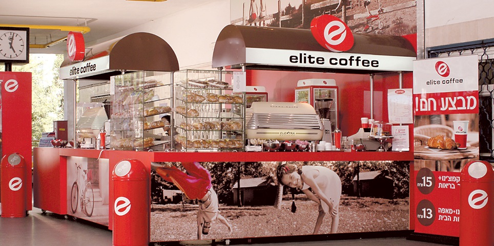
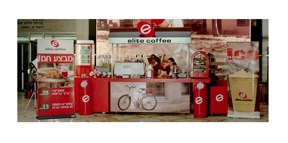
The photographs were used extensively on all graphic materials (packages, advertising, promotional material) but mainly as very large “super graphics” in all points of sale: coffee carts and coffee bars.
What We Did?
Concept development
design
Logo design
Symbol design
Package design
Letterhead design
Marketing materials
Architectural guidance
Branded environments
Point of sale
signage
Photo shooting production
Printing supervision
Manufacturing supervision

