ESC |

The year was 2002. Pelephone found itself in a bad situation, as its brand was no longer relevant to its young customer base.
The market was dominated by two brands with clear positioning:
Cellcom – young, ‘my friend’
Orange – international, optimistic and young
All this took place at a time before mobile number portability, and – as with public health clinics or banks – cellphone brands that had failed to make themselves attractive to the youth market were faced with extinction.
Pelephone’s various attempts to connect to the youth market via sub-brands such as Pelephone Chat did not go well and did not have any effect on the target market.
Building, deploying and supporting a new brand requires considerable financial investment, which Pelephone was not happy about – but the company understood that it had no choice and that it needed to approach young people with a new brand.
We carried out the strategic work in conjunction with in-depth market research and an understanding of the obvious and hidden needs of young people and young consumers.
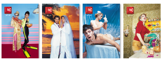
Through the research, we obtained insights that helped create the brand name, Escape. Its meaning was not ‘escapism’, but rather an alternative to an ordinary world that young people perceived as boring and stressful.
The logo’s visual expression was inspired by the Escape key on a computer keyboard – a language that appealed to young people who feel more connected to the computer than the pen.

The brand language was surreal and larger than life. Its content included those things that interest young people (but not only young people) – sex and music.
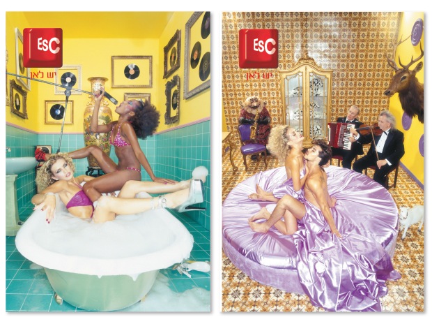
The brand did not speak the language of cellular communications, but that of youth.
The services Escape provided were not limited to ‘send and end’ but included text messaging, games and trendy handsets.

The ads for Escape did not show anyone talking on the phone. This is commonplace now, but in 2003 it was groundbreaking.
 There was a huge dilemma about the brand architecture. Pelephone wanted to emphasize the brand’s strong identity.
We had to remind them that the Pelephone brand was not relevant to young people and so its presence needed to be minimized. The only justification for having the Pelephone brand was to make people aware that this was a serious, established company.
The solution was “light endorsement” in the brand materials, via a reference to Pelephone’s former “rings” symbol (a logo we designed), without mentioning the name of the brand.
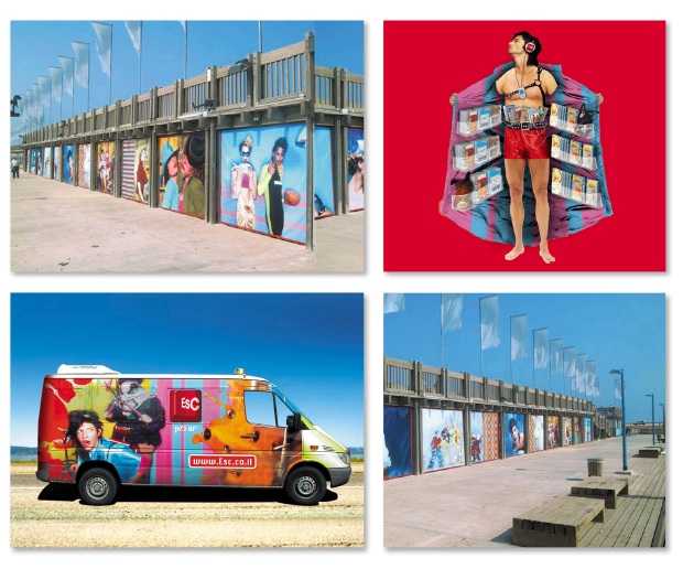
Escape rapidly became a desirable and different brand, to the degree that it was impossible to ignore it.
The brand language was soon imitated by other brands (including in a Levis catalog published a year later).
Within a short space of time – particularly for a new brand – Escape had no fewer than 200,000 subscribers. Most importantly, however, its parent company Pelephone had once again become relevant.
Some people think the brand was unsuccessful and that it disappeared from the scene.
The truth of the matter is that Pelephone had no reason to maintain two brands over the long term.
As a result of Escape’s success, Pelephone got a new lease of life, underwent a rebranding process and made a comeback as a major player.